
Sorry for being AWOL folks, but the first week of the Easter holidays has left me drained, and suffering from a really bad back, I know exactly what I did to set it off, I dangled from a tree, but teamed with the general bits and bobs that life throws at you in the holidays, I am feeling a little under the weather and have only just ventured back to my desk tonight, the first time since Tuesday!
Anyway feeling a little brighter after a chat with my mum this evening, I got heather to help me shoot a little video, on an ace technique, I shared with my 'Creative Cafe' ladies at our last session.....
I think I may have managed to refrain,
from my favourite phrase too!!
I was inspired to create, after seeing the cards & projects in the May edition of Craft Stamper, in the 'Stamping Contrasts' section. There were a few inky backgrounds and I fiddled around getting that effect with my SU stash!
Here are some pictures of the cards, as the film doesn't show the colours of the purple one well....

Shades of yellow, with 'Soft suede' stamping
& card stock trim...

Purples with 'Basic Black' stamping & card stock trim...

And my final colour combo.....
Blues with 'Basic Black' stamping & card stock trim.

Here is a close up of the greetings, which are all in the stamp set, they were punched with the 'Decorative Label' punch & given a little stamping with the frond that is in the stamp set too!!


The inside was given a little stamping too!

And here is a list, were I jotted down which markers I used for my colour combos.

I hope you give this technique a try, as I say in the video...
If it isn't quick easy and achievable, then I wouldn't do it!
And do get in touch, and let me know if you come up with some different colour combos.
xXXx
 I love cards that are just one layer and have noticed that in card shops they can be ultra expensive, so armed with my stamps I came up with these! The finished cards measure 10.5cm square. The outline images were stamped in Stampin' Up! 'Basic Black' and with a bit of playing on some scrap first, I was able to line the stamps up 'freehand'. Colour was added by using the water brush and ink from the lid of the Ink pads. The colours I choose were.....

 Tempting turquoise


 The sentiment for the main topper came from the 'Just Believe' SU stamp set, it is stamped in 'Chocolate Chip' SU Ink.
 When I had finished the 12x12" base, I had a look through my box of photo's and came across this one of 'Foxy....sunday name Foxglove!' she is our beautiful 'so grey- she is white' pony, she taught Heather how to ride, and 'Baggins' that wheelie bins and blue garden plants won't kill you! Anyway if I told you were she was when I took this photo, of her with heather and Matty...you would think I was crazy....well, yes, I am! And yes, she was in the living room!
 A few splats were add, by flicking the plastic tube in the spritzer accross the page.....
 I felt that the base page needed something to draw the eye from the decoration at the bottom, to up and across the page so added a few butterflies from the 'Strength & Hope' SU stamp set.
 I then created a wide matt for the photo using the same butterfly, by stamping it in 'Basic Black' around the edge of a piece of the textured white card, I also dragged the ink pad around the edge of the card to define it.

 And the reason for folding the 'Top-note' die cut in half...well it gave me a little area to add some journalling...well I don't want the whole world to knew that i had a pony in the living room! ;-)
 Don't forget about the fantastic offer from 'Stampin' Up!' if you place an order for £75 or over, or host a workshop with sales totalling over £250 before P&P, you get the fantastic cosmetics tote, ribbon and clips, so everyone gets a chance of this offer I am placing weekly orders myself, so email me to find out more. xxx
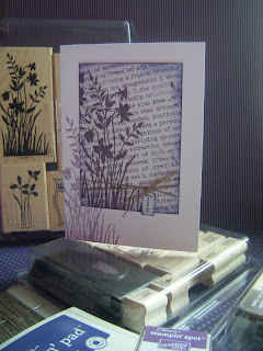


 I cut the numbers using my 'Big Shot' and the numbers from the 'Timeless Type' Alphabet die set, from a few scraps of 'Melon Mambo' card stock. The frame was stamped once in e

